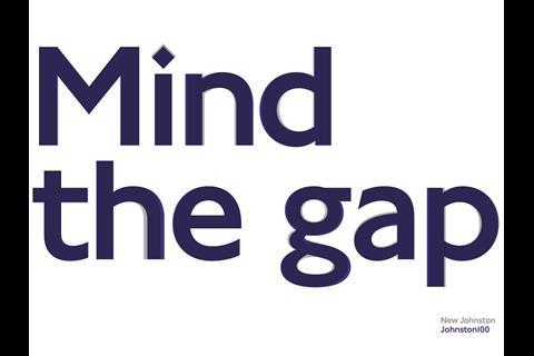
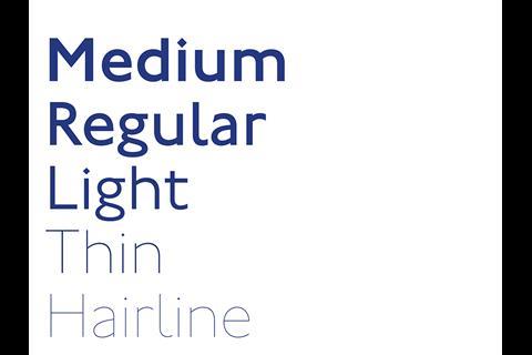
UK: Transport for London is to begin rolling out an updated version of its distinctive 100-year old typeface, which is designed to be ‘fit for purpose in environment where digital is as strong as print’ and includes the # and @ symbols for the first time.
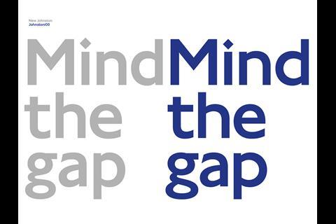
The original Johnston Sans font was commissioned from calligrapher Edward Johnston and introduced from 1916 to bring visual uniformity to London’s transport network. It was subsequently revised by Eiichi Kono as New Johnston in the 1970s. The latest revision is known as Johnston100 and was developed by Monotype.
‘The philosophy of the Johnston design is consistent throughout, and in such a way, the typeface was versatile enough that it could sustain all of these different fashions and usages that have come in the last 100 years’, according to Monotype Director Nadine Chahine. ‘It was very important to TfL that we add the extra-thin weights, because of today’s digital trends.’
‘Releasing the updated Johnston100 typeface is an important step forward’, said Jon Hunter, Head of TfL Design. ‘This will start appearing across the network later this year in a number of guises and we plan to announce the first place it can be seen on the Underground very soon. We hope this version of the “lettering of London” for the digital age will last for another 100 years and beyond.’

