Major projects have more glamour, but smaller changes desired by local passengers can have disproportionate impact on the user experience, says Charlie Morse, Senior Chartered Engineer at SNC-Lavalin.

UK: It’s 08.00 on a rainy Monday morning, and at Tulse Hill station in south London commuters are waiting for the train to take them to work.
The weather is dreadful, and because the roof only covers part of the platform, most people are huddled beneath the ageing modular shelter on the narrow island platform. With so little covered space at platform level, passengers are inevitably forced across the yellow line as they attempt to find room. May people linger on the subway steps, staying dry for as long as possible, but potentially lengthening the dwell times when the trains do arrive.

Scenes like this were once commonplace at Tulse Hill, and the need for change became urgent.
Delivering local benefit can be a major challenge: how can the needs of the immediate communities genuinely be met? Applying top-down solutions tends to overlook those small but significant changes desired by passengers, and limit the potential benefits for the wider local community.
In order to create a truly effective railway, the passenger experience must be approached holistically. Considering the overall user journey from top to bottom can identify ways to improve the process. But to do this as effectively as possible requires listening to listen to the passengers themselves. Every aspect of a project, from design to construction phasing to health and safety, can potentially be improved by considering it from the user perspective.
All change please
Originally scoped in the National Stations Improvement Programme, the works at Tulse Hill were informed by a passenger survey which flagged up a number of issues, from ticketing machines to insufficient roof covering on the four platforms. Some issues, such as the poorly-lit access path outside the station, were driven by the community. Gaining feedback from the users allowed us to understand which were the most important factors affecting their experience.

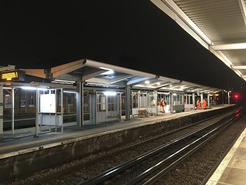
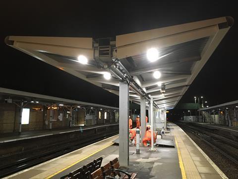
The main issue was safety. Tulse Hill is a busy station, and overcrowding is a problem, particularly on the narrow central island platforms 2 and 3. The new design envisaged a more open layout, more conducive to passenger good flows. Replacing the old shelter by a larger canopy would also remove some of the physical obstructions close to the platform edge. Proactively eliminating a potential incident through design was a constructive step towards a safer station.
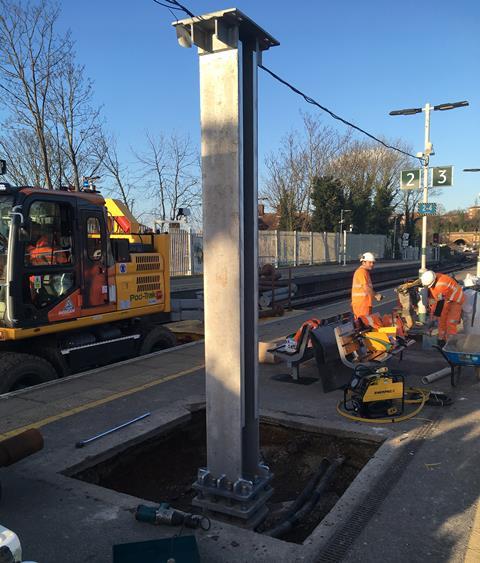
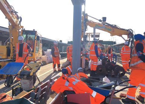
The new platform canopy was designed from GRIP 3 to 5, utilising screw pile foundations and a bespoke steel support structure. Although partly composed from recycled material from the old shelter, increasing sustainability, it was more aesthetically pleasing, eschewing the previous nakedly monochrome design.
In order to simplify and speed up future maintenance, the gutter and electrical routes were made accessible from below. And minimise disruption during installation, the modular superstructure was designed to be lifted over onto the island platform in a long possession. With 2 h available each night during mid-week possessions, it took just 6 h to fit all the roof sections together — thanks to some meticulous planning undertaken beforehand.
The designs were presented in Network Rail’s Form 001, 002 and 003 formats and managed by an internal Contractor’s Engineering Manager as well as the Contractor’s Responsible Engineers. By considering the user experience thoroughly throughout the design, adjustments could be made leading to tangible benefits.
Passenger first, safety first
Part of being passenger-centric means being safety first. It means considering the impact of construction on the user, not just the end result.

The new station design had to be safe and usable throughout the phasing of the works. With the work scheduled to take more than a year between the demolition of the old shelter and the completion of the new canopy, it was necessary to keep the passengers dry and safe during this period. A temporary roof over the platform was installed to make sure there was always protection from the elements outside of the possession windows. To maintain the safety and usability of the platform surfaces, foundation holes had to be covered up and trip hazards avoided. Rather than letting the passengers suffer, the planning process considered what the station would actually be like to use through the construction phase.
A platform for better
From signposting to navigation, passengers begin to ‘experience’ a station before they actually enter, and well before they reach the platforms.

Using survey insights from both passengers and staff, adjustments were made to the main concourse, staff rooms, ticket office, toilets, gateline, entrance and other facilities, improving the overall usability of the station. As well as providing a better quality of user experience, these enhancements also improve the flow of passengers through the premises.
Such details can often be overlooked, especially during works at smaller stations lacking the allure of major projects. Yet to be serious about improving the passenger experience, it is vital to understand how people move through stations, collecting their thoughts and feelings to pinpoint those unpleasant stressful moments which could make them wish they had taken the car instead.
Improving the perception of our railways means giving people a smoother, more seamless, and more comfortable experience. Ultimately, the fewer obstacles people face when boarding and alighting, buying a ticket or locating platforms, the more likely they are to use their local trains. With a safer, smoother experience, passengers can reap the benefits of using their neighbourhood station, resulting not just in better transport but in a better social experience as a whole.
That’s what making local improvements is all about.


